
Mid-Century
A little colour, a little rhythm. Mid-Century turns geographic areas into clean, coordinated fields with the easy warmth of a graphic poster. Familiar streets give the composition its shape; your palette gives it its mood.
Play with Mid-CenturyIn the studio, choose Mid-Century under Theme, then pick a style.
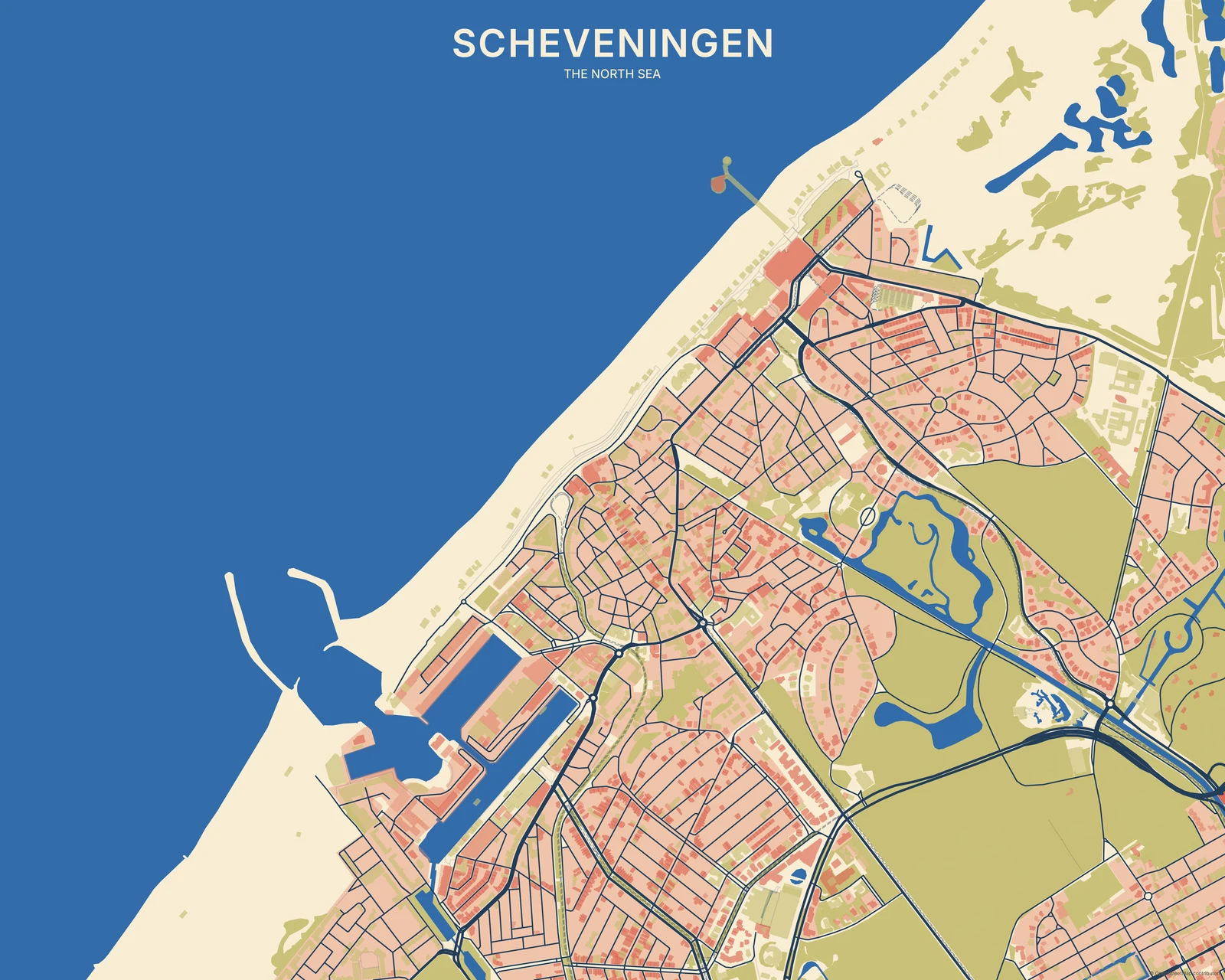
Colour does the heavy lifting
The surfaces stay mostly flat, so the relationship between cream, blue and warmer accents remains easy to see. Structural lines hold the shapes together without a heavy material effect. It’s more controlled and period-inspired than Abstract, and cleaner at the edges than Risograph. The map provides the pattern—there are no added retro ornaments to distract from the place.
Find your starting style
Riviera and Mediterranean balance warm land with blue. California has a warmer retro mix, Nordic keeps things muted, and Atomic gives primary accents more punch.
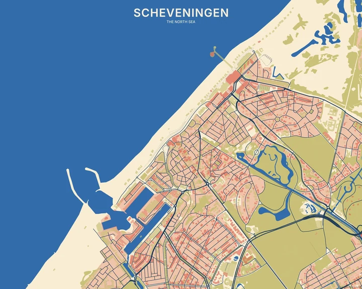
Riviera
Scheveningen
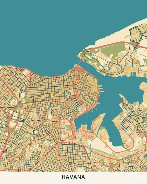
California
Havana
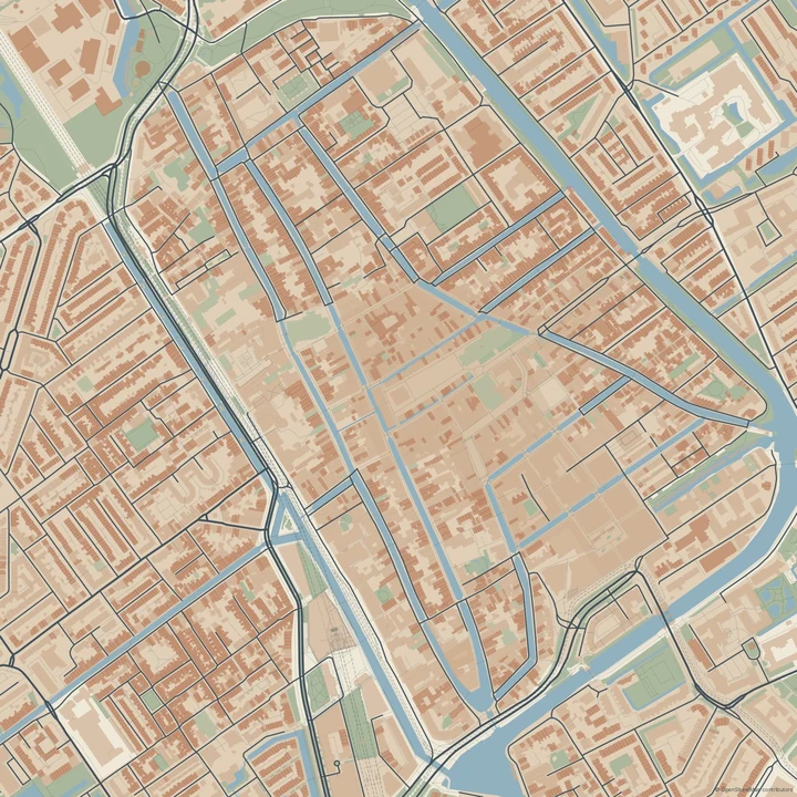
Nordic
Delft
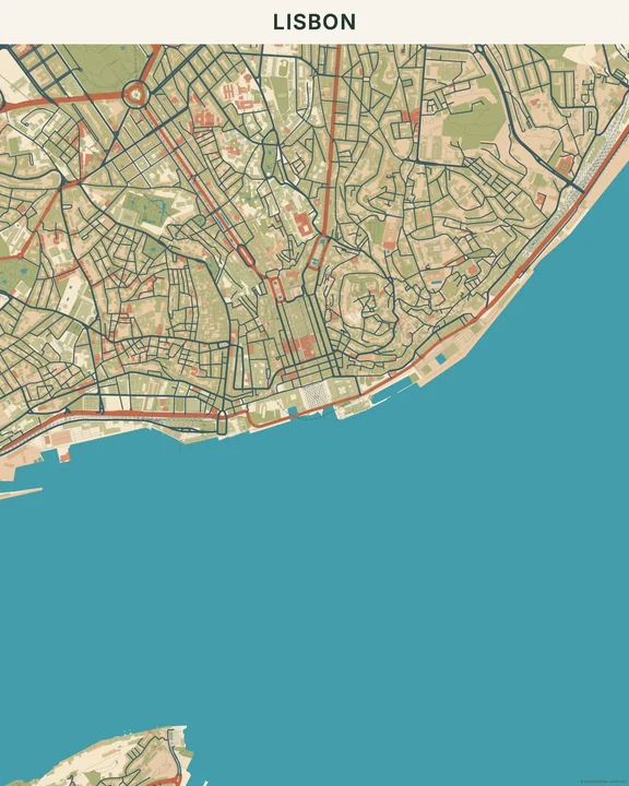
Mediterranean
Lisbon
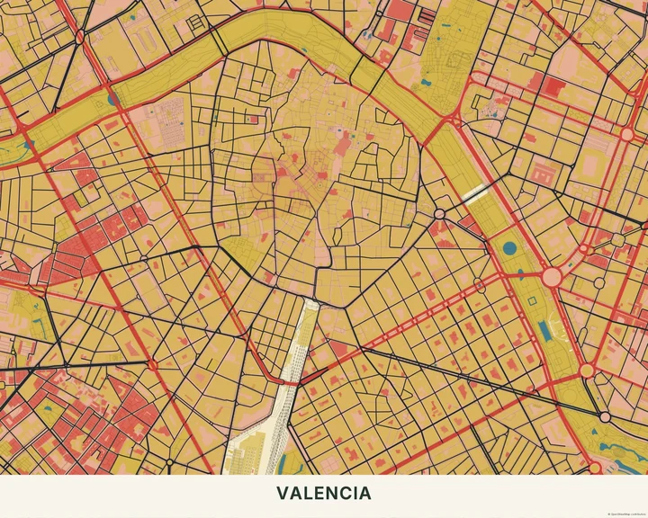
Atomic
Valencia
Find a colour conversation
Try two or three layer colours that you enjoy together, then move the map to balance their areas. A title, simple shape or small marker can join the composition. Leave enough open space around it to keep the easy poster feeling.
How it worksMaps in this theme
Scheveningen in Riviera
Mid-Century · Riviera
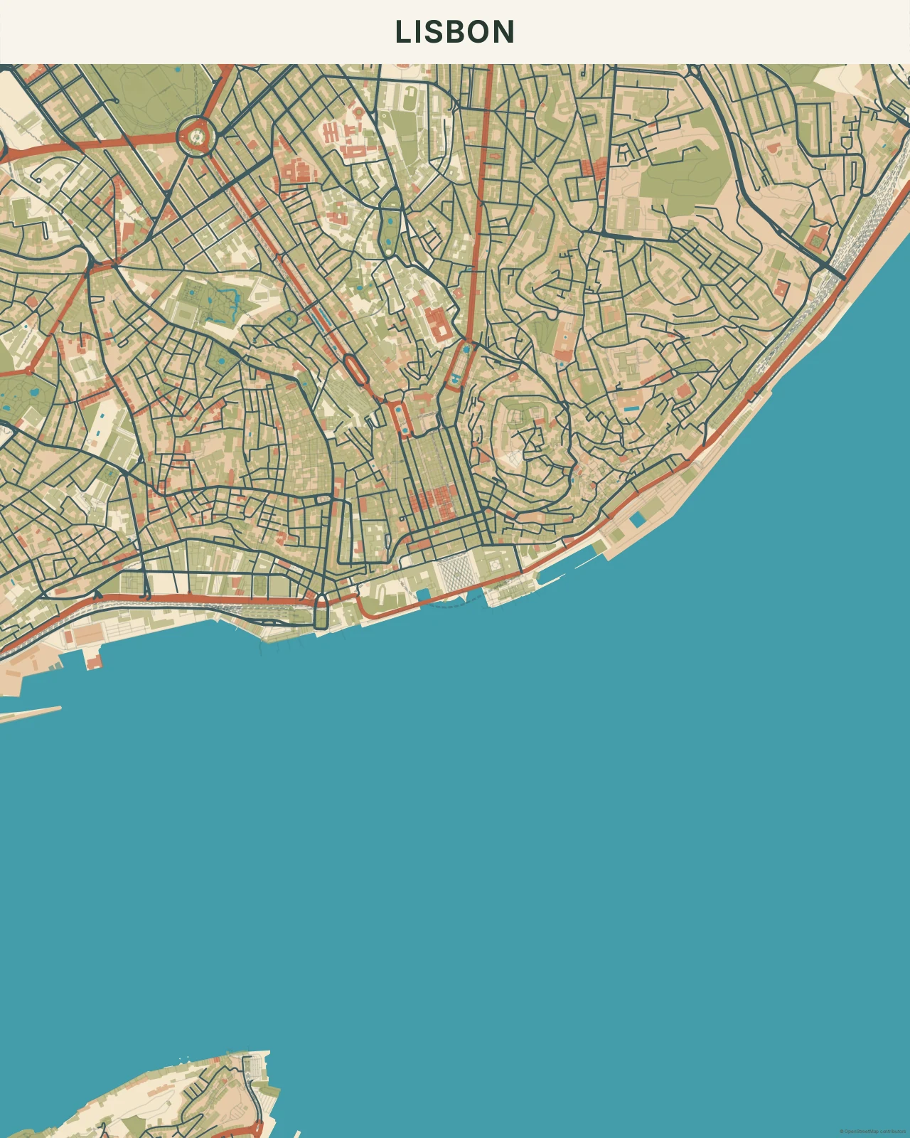
Lisbon in Mediterranean
Mid-Century · Mediterranean
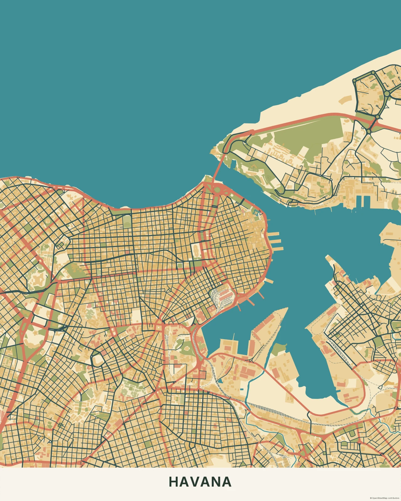
Havana in California
Mid-Century · California
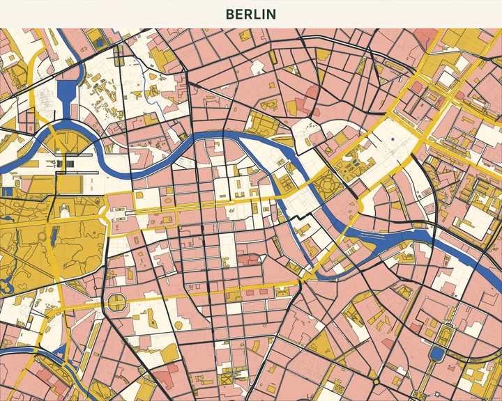
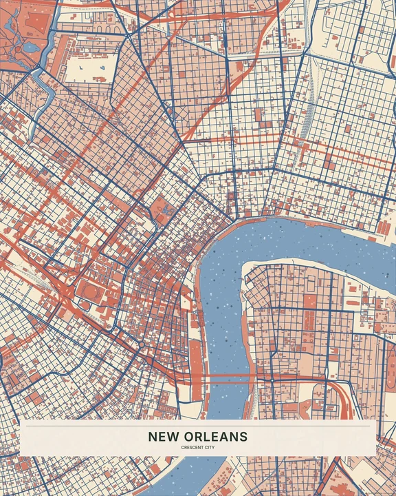
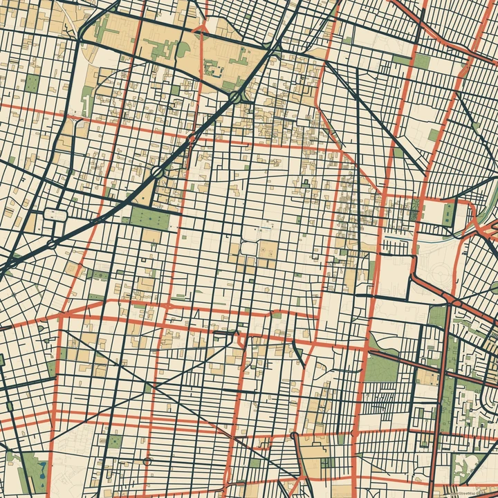
A familiar place, in good colour company.
In the studio, choose Mid-Century under Theme, then pick a style.
Selected places, real geography. Search the editor for your own place and check the available map detail. © OpenStreetMap contributors